Visualizing consumer preferences: the power of Sankey diagrams in liking tests.
Sankey diagrams emerge as an ideal solution for visualizing changes in consumer preferences, clearly showing the flow of preference shifts among the different tested products. These diagrams, originally used to represent energy flows, are now applied in various fields, from cost management to data visualization in research. The distinctive feature of Sankey diagrams is their ability to clearly show the amount of flow passing from one node to another (vertical lines), making it evident where the flows are most concentrated (horizontal bands) and how they are distributed throughout the represented system. The widths of the lines connecting these states are proportional to the amount of flow, providing an immediate visual representation of changes and distributions. When applied to the visualization of data obtained from liking tests, they allow us to see how participants move between different categories of liking, precisely highlighting changes in preferences.
In liking tests, consumers express their preferences for a product or service. These preferences can vary over time or in response to changes in the product’s characteristics (such as formulation). Understanding how and why these changes occur is crucial for product development and supporting effective marketing strategies. In this context, Sankey diagrams can visually and appealingly show how user preferences shift from one version to another. For instance, if a group of consumers initially prefers a specific version of a product but then changes their opinion after trying a new version, the Sankey diagram immediately makes this shift visible. Polarized or multimodal results pose particular challenges in this field, as they imply strongly contrasting opinion groups or non-uniform distributions of preferences, which are easily identifiable through Sankey diagrams.
A practical example: comparing product versions.
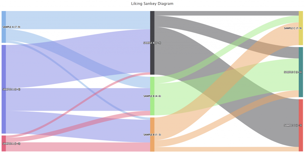
To concretely illustrate the potential of Sankey diagrams, let’s look at the following image. In this example, we see how participants in a liking test move between three versions of a product: Sample A, Sample B, and Sample C. The vertical axis shows the categories of liking expressed on a 9-point Likert scale: low (scores from 1 to 3), medium (scores from 4 to 6), and high (scores from 7 to 9). The colored bands represent the flow of preferences between samples.
This diagram not only highlights the change in preferences but also shows the extent and direction of these changes. It is possible to see not only how many consumers have changed their opinion but also which version has gained or lost favor compared to the others. This type of insight is crucial for making informed decisions about which version of the product to bring to market or which aspects to further improve.

Benefits of Sankey Diagrams.
Using Sankey diagrams in liking tests offers several key advantages:
- Visual clarity: Changes in consumer preferences are presented clearly and immediately, making it easy for anyone to understand the test results.
- Understanding dynamics: Sankey diagrams not only show a snapshot of preferences but also reveal how and why these preferences change, providing a deeper understanding of the underlying dynamics.
- Effective communication: These diagrams make information accessible not only to experts but also to a broader audience, facilitating the communication of results within the company or with clients.
- Strategic decisions: Thanks to their ability to highlight preference flow changes, Sankey diagrams support more informed strategic decisions, allowing a focus on the products or services with the greatest potential for success.
Summarising
A New Perspective on Liking Tests
Incorporating Sankey diagrams into the visualization of liking test results transforms complex data into powerful visual stories. These tools not only show how preferences change but also reveal the nuances, enabling a deeper understanding of the motivations behind consumer opinion shifts. If you seek a clearer and more comprehensive understanding of liking dynamics, Sankey diagrams are the key to illuminating the paths your customers are taking.


