A Comprehensive guide to leveraging Violin Plots for deeper data interpretation
Preference testing is a widely-used research methodology to evaluate the acceptance level of a product, service, or experience among a group of users or consumers. These tests yield valuable insights into how specific target audiences perceive offerings, allowing for refined marketing, product, and development strategies tailored to audience preferences. Traditionally, analyzing the results of such tests has focused on using central metrics like the mean to summarize the collected data. However, this practice can lead to an incomplete understanding of audience preferences.
Beyond the Mean: the importance of data distribution
Solely focusing on the mean value of data collected from a preference test can be misleading, as it fails to reflect the variance of opinions among participants. For instance, two products may have the same average preference score, but one could have polarized reviews (very high and very low), while the other may have a more uniform distribution of ratings. This distinction is crucial for truly understanding product preference and making informed decisions about its future development.
Limits of Box Plots in data visualization
Box plots have been the standard tool for visualizing data distribution in preference testing. These graphs provide a visual representation of the median quartile of data, the extremes, and any outliers. Although box plots offer valuable insights into data distribution, their interpretation is not straightforward for everyone. Particularly, individuals without a strong statistical background may find it challenging to extract meaningful insights from these graphs, limiting their effectiveness in communicating preference test results to a broader audience.
Violin Plots: an intuitive approach to data visualization
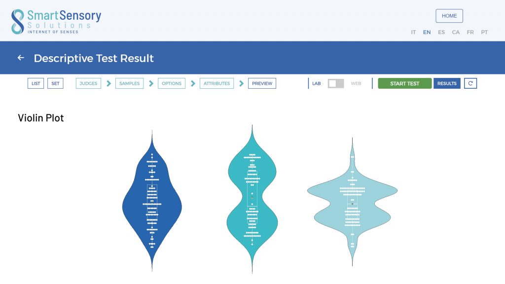
Violin plots emerge as an innovative solution to overcome the limitations of box plots, offering a more intuitive and detailed visualization of data distribution. Unlike box plots, violin plots combine a representation of data probability density with the structure of a box plot, providing a comprehensive view of both data distribution and its quartiles. This makes them extraordinarily effective in showcasing the full range of participants’ reactions to preference tests.
The “violin” shape in these graphs illustrates where the data is most densely concentrated, allowing observers to quickly identify patterns such as bimodality, which would be difficult to discern with box plots. Furthermore, the symmetry and aesthetics of violin plots make data distribution accessible and easily interpretable even for those unfamiliar with statistics.

Simplifying data analysis with Violin Plots
The use of violin plots in preference testing represents a significant advancement towards simplifying data interpretation. By making data distribution intuitive and visually appealing, violin plots enable a broader audience to participate in decision-making based on test results. This not only enhances collective understanding of the data but also promotes a culture of informed decisions stemming from a deeper understanding of consumer preferences. Ultimately, adopting violin plots in preference testing empowers organizations to make more inclusive, data-driven decisions, more accurately guiding product and service development towards what consumers truly desire.


